As someone deeply invested in creating safer environments for older adults, I have realized that even a tiny design choice can change everything. When we design spaces or pick cognitive tools for seniors—whether at home, in adult day care centers, or in nursing homes—color choice requires careful consideration.

Younger generations often associate blue with calmness and trust. However, seniors experiencing age-related changes see it entirely differently. Natural aging of the eyes, lens yellowing, or macular disorders completely distort how they perceive this color.
This guide outlines how caregivers, facility managers, and families can safely utilize blue in daily care environments while avoiding critical hazards.
What to Avoid: Critical Hazards of Blue in Senior Care
1. Avoid blue text or backgrounds for important signs and medication labels
As the eye’s lens ages and yellows, it acts as a natural filter. This change makes blue tones appear as a dull gray or dark muddy color to older adults.
- The Risk: Directional signs using blue text or medication schedules with white text on a blue background create severe visual blind spots for seniors. They often see the text as blurred or smeared, which can easily lead to cognitive errors or dangerous medication mishaps.
- The Solution: Use orange, yellow, or red for crucial information, as these wavelengths penetrate the yellowed lens most effectively. Alternatively, stick to black text with high luminosity contrast (a sharp difference between light and dark).

2. Do not use blue mats or tape on bathroom floors or stair edges
Seniors find it highly difficult to clearly distinguish blue from green and dark gray.
- The Risk: Placing blue non-slip mats on bathroom floors or sticking blue tape on the edges of stairs to prevent falls usually backfires. To a senior’s eyes, these blue surfaces can look like deep holes or sudden drops. This optical illusion causes hesitation in their stride, paradoxically increasing the risk of falls.
- The Solution: Use highly visible orange or yellow safety tape to mark boundaries or hazardous areas.
3. Avoid blue-toned lighting in dining areas and kitchens
Some facilities use subtle blue lighting to create a modern ambiance, but this is a mistake for meal spaces.
- The Risk: Under blue light, food loses its natural color and appears grayish, which drastically suppresses a senior’s appetite. Furthermore, caregivers and seniors will find it visually difficult to detect spoiled parts of food or foreign objects.
- The Solution: Dining areas and kitchens should use warm white or bright amber lighting. This preserves the natural, appetizing colors of food, stimulating the senses and helping seniors maintain a healthy food intake.

💡 How to Use: Smart Ways to Utilize Blue in Daily Care
While blue is unsuitable for indicators and safety markers, science proves its psychological benefits. The key is to use it as a “background or relaxation element,” rather than a functional feature that requires sharp visual focus.
1. Use light blue as a background color for rest and sleep areas
The calming psychological effect of blue—which helps lower blood pressure and pulse rates—remains effective for seniors. However, it works best as a passive background rather than for sharp details like text or lines.
Consider painting one wall pale blue (pastel tone) or using soft blue hues for curtains and bedding in bedrooms or lounge areas. This provides a sense of psychological stability and helps soothe nighttime agitation or delirium associated with dementia.

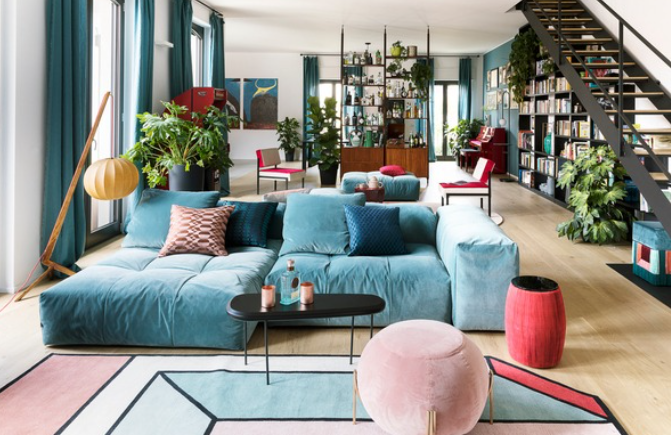
2. Utilize high contrast with dark navy to improve spatial recognition
While standard blue appears blurred, deep navy blue stands out. Seniors clearly perceive it as a distinct dark tone.
Try using deep navy for sofa or chair upholstery against bright ivory walls. The clear contrast between light and dark helps seniors intuitively recognize the seating area (“That is where I should sit”), ensuring a safer and more confident approach when sitting down.
3. Adjust difficulty levels in cognitive training tools
When conducting cognitive rehabilitation programs or board games, you can use the unique characteristics of how seniors perceive blue to adjust task difficulty.
For early-stage seniors, use easily distinguishable color pairs like “Red vs. Yellow.” To increase the cognitive challenge or test precise color discrimination, introduce “Blue vs. Green” or “Blue vs. Purple” cards. Recognizing these subtle differences serves as an excellent brain-stimulating exercise.

Summary: The Core Strategy of Senior Color Care
The rule of thumb for using blue in senior care is simple: completely exclude it from instructions, signs, and hazard markers. Instead, limit its use to emotional and environmental stability—such as soothing bedroom backgrounds or high-contrast furniture arrangements (using dark navy). Small adjustments tailored to a senior’s vision are the first step in preventing avoidable accidents.
Leave a Reply